The Layout System
Thanks to our grid system of rows, columns, and modules, sites are unique and dynamic. These fundamental elements can be compiled in almost infinite combinations, giving the ultimate flexibility to accommodate any page layout imaginable.
Rows
Rows are horizontal sections spanning the width of the site's content area (fixed setting) or the entire screen area (fluid setting). Rows can be styled individually so that each row looks unique.
Columns
Columns are vertical sections nested inside the rows. The width of each individual column can be easily adjusted by the designer.
Modules
Modules (where text, images, and all other content will reside) can be placed freely inside columns (which are, in-turn within rows).
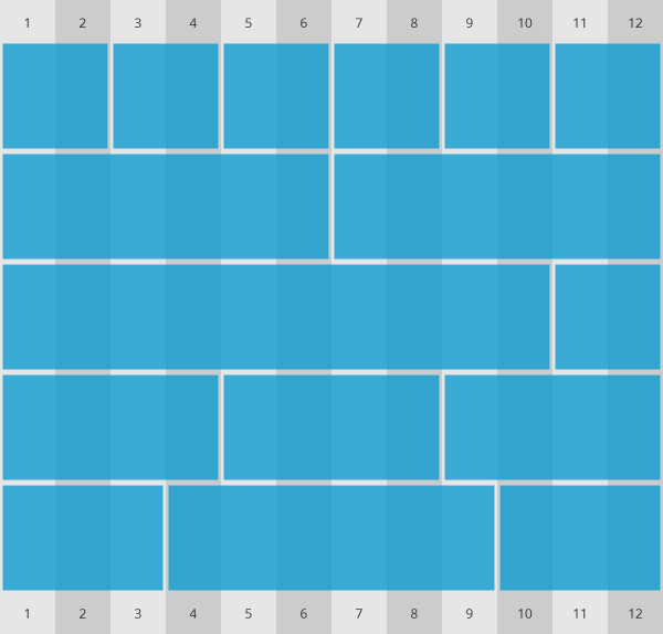
The layout system is based on a 12-column grid
Fixed Row
Column
Module
Module
Fluid Row
Column
Module
Module
Available Modules
-
Text
-
Image
-
Button
-
Google map
-
Gallery
-
Form
-
Mailchimp form
-
Divider
-
HTML
-
Payment icons
-
Paypal button
-
Vertical navigation
-
Email share
-
Search
-
Video
-
Price list
-
Blog catalog
-
Social media links
-
Facebook like
-
Facebook share
-
Facebook send
-
Facebook post
-
Facebook video
-
Facebook comments
-
Facebook embed page
-
Instagram embed
-
Google+ button
-
Google+ follow
-
Twitter share
-
Twitter follow
-
Twitter hashtag
-
Twitter mention
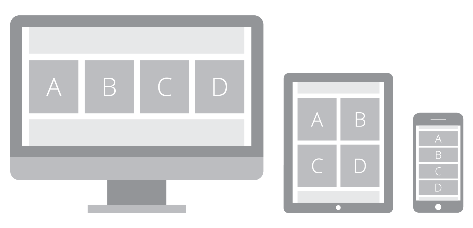
Responsive Layout
The website platform allows the designer to customize the layout for desktop, tablet, and mobile views. For example, on tablet and mobile, the designer may stack the columns as shown below to provide the best appearance on smaller screens. This kind of responsive design makes the website inviting and user friendly, no matter what device it’s viewed on.
Designers can also adjust the following styling settings uniquely for desktop, tablet and mobile viewing.
Per-device Styling Options
-
Font sizes
-
Column widths
-
Number of columns in lists
-
Image and icon sizes
-
Show/hide elements
-
Number of columns in galleries